Did you notice a recent change in the manner Google ad search results are displayed on your desktop? It is no secret that Google’s parent company, Alphabet, earns its maximum revenue share from Google ads, and this recent attempt to blur the visual distinction between ads and organic results would have had a huge impact on user behavior.
Last week, Google began to roll out a new desktop search change update that in a way, blurs the line between organic results and the ads placed above them. Said to include a purposeful dark labeled favicons next to the ads in search results in the January 2020 edition of the desktop search results, this new trend will lead to more users clicking mistakenly on the ads, resembling the organic results.
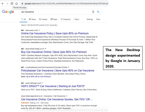
Figure 1: The new desktop layout experimented by Google included favicons that appear next to the URLs, for both, the organic results and the Google ad listings. This step was taken to help sites with branding and make the search results align the way it is presented on mobile, since late May 2019. However, according to marketers, the new layout was introduced to make it harder to distinguish between the paid and the organic results. The redesign dimed the attention between organic results and the ads, by placing an “Ad” favicon next to the advertisements in the SERP. Since the design is streamlined, users mistake ads for actual results and instead click on them. Furthermore, early analysis reveals a slight increase in the ads clicks as a result of the new design, on the mobile version.
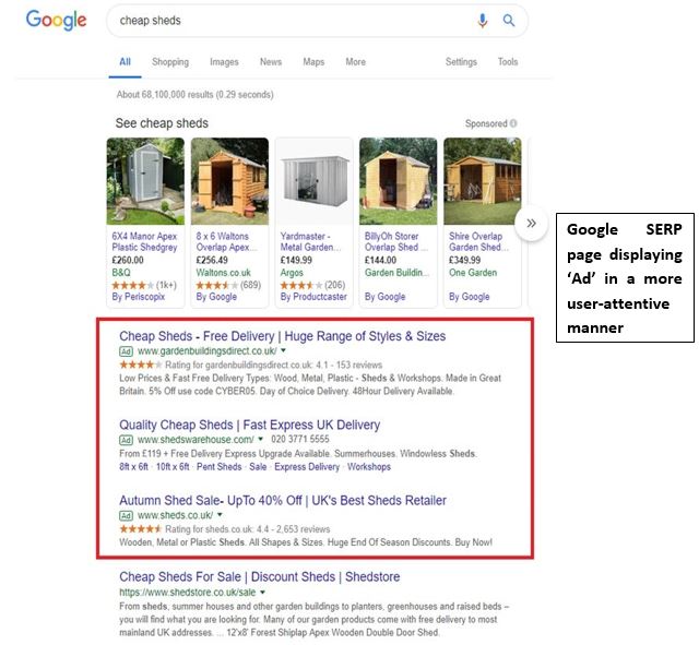
Figure 2: This is how Google desktop results looked like before the January 2020 experiment was handed out. In this SERP, the ad listing was distinctively labeled, which made it easy for users to identify the difference between the Google ads and organic results. In a rather user-concentrated manner, the ads layout pattern followed before was labeled to make it look different. It made it easy for users to skip the ad results and focus on the organic ones.
The black “Ad” label was released by Google, for its mobile version in May 2019, a replacement to the green outline label introduced by Google, in 2017. The dark pattern gave organic listings a new favicon look, similar to the ad results.
As per Google’s announcement, “When you search for a product or service and we have a useful ad to show, you’ll see a bolded ad label at the top of the card alongside the web address so you can quickly identify where the information is coming from.”
A similar rearrangement was followed further, for the tech giant’s desktop version as well, alienating any difference between the ads and organic results. According to experts, the recent design change in Google desktop search results, displaying favicons and extra header text, makes every search result look like ads.
According to Broke Osmundson, the Associate Director for a digital agency, for every four clients, desktop users were 4 to 10.5% more likely to click on paid ads in the week after Google made the changes than they were, in the week before that.
Moreover, when the layout of the SERP was changed for mobiles, on May 22, 2019, the click rates increased 17% to 18% for companies placing their advertisements on the SERPs from May 24 to 30th stretch, in comparison, with the May 17 to 23rd slots.
As per the reviewers, a rise in the ad clicks will increase the CTR. An increased CTR (Click Through Rate), will reach the budget limits quickly, which will be great for companies placing their advertisements on SERPs, but that will impact the user experience on the site.
Moreover, the striking resemblance between new Ad favicon and that of organic results blessed brands, with a good CTR, however, with time, people got accustomed to it, and hence, the redesign has a slight muted effect on the users.
According to Google, their goal is to create a better search experience for users. Their main motto to make the Ad favicons look similar to the organic results one is to make sure that users are satisfied with ads. So, when a user clicks on an ad, it is not because it looked confusing, but because it was relevant and useful.
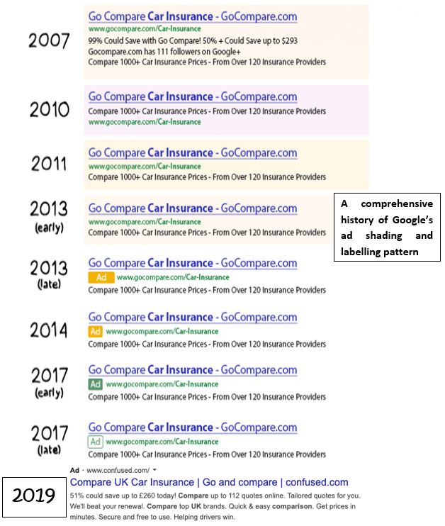
Figure 3: The following is a comprehensive history of Google’s ad shading and labelling over the years. Although the favicon looks more subtle now, the colour fade scheme followed by Google has made the ad results indistinguishable from the organic ones. This manipulative design practice was implemented to trick users into clicking more on the ad listings, which is the major revenue source for the parent company of Google, Alphabet.
If you Google for most of your queries, you might have seen a specific layout for every SERP, in which the first section is assigned to shopping ads, then comes the search ads, and then the organic results. Since organic results are given the last slot, the top section of the search ads and shopping ads, is what attracts the crowd. More clicks on any of these ads mean more profit for Google, and the retailers, associated with the ad.
Studying this buying nature, research by Merkle, states that ad spend has increased by 38% on Google Shopping and has decreased by 12% for search ads. As for now, Google Shopping accounts for 65% of the Google Ads and 89% of the non-branded Google search ads for the retailers.
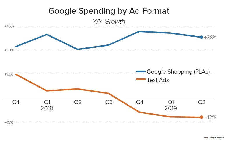
Figure 5: The following graph shows the Google spending by ad format for Shopping Ads (in blue) and the Text ads (in orange).
Most of the digital researchers believe that the reason this new design was reciprocated on desktops is that Google earns a big margin through its ad business. Google said that the new desktop result is an expansion to the layout implemented on mobile phones, last summer, in 2019, however, its desktop version did spark some confusion among the users who saw it.
This new design, came as a wake to the slowdown of the ad revenue earned by Alphabet, in its first-quarter of 2019, followed by a decline in the profit in the third quarter, in comparison to a year before. However, since then, the ad revenue share of Alphabet has been rising tremendously, achieving a trillion-dollar market cap for the first time, last week.
The implementation of Google’s newest redesign for SERP would have had a diverse impact on Google ad’s share and retailers. According to research, the new layout resulted in a 15% increase in the number of clicks on mobile ads, in 2019, since the layout was rolled out for mobiles. Studying this user nature, Google tried to roll out a similar layout for desktop search result, however, the feedback will make the tech giant experiment with more forms of ad labelling.
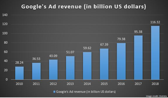
Figure 4: This revenue figure doesn’t come as a surprise, as Google holds most of the online and mobile search market, worldwide. As of today, Google is responsible for more than 90% of the global search traffic and holds a market share of more than 90% worldwide. In 2019, advertising came out to be the highest source of revenue for Google, and with the implementation of the new Google Ad design, their advertising power is only going to accelerate.
With organic search results mimicking closely the ad layout, Google tried to obscure the ability of the user to differentiate between the two (Google ads & organic result). Amidst the confusion, a user might mistakenly click on ads, in turn, increasing the ad click-through rate. Google wanted to test the user response on this new layout, therefore the theme was first updated on mobiles, and after a successful run, it was reciprocated on the desktop. If the layout is followed, it will surely increase Google’s ad revenue for the many upcoming quarters, however, its impact on the retailers is highly puzzling.
On the other hand, many experts believe that even organic results are similar to the ads since a lot of investment is put-in by companies to ensure that their website is ranked on the first page of Google. All in all, Google will earn huge profits from its new favicon-based SERP layout, after the testing is completed. Google is known for its amazing user experience, and retailers will be on the bad end of the bargain if their ad is not something that the user is looking for.
In the end, a user is going to choose an option that is most relevant to their needs, regardless, of it being an ad or an organic result. The better the site optimization, the more easily it can answer to the query of the user, organically. The dynamics of search conducted on Google might indeed alter, for some time, however, sooner a user understands what Google is trying to do, the more easily they will adapt to the new layout.
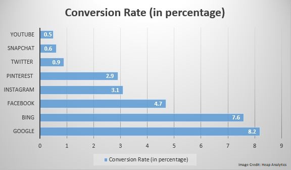
Figure 6: The following graph depicts the average conversion rate by advertising channels. The average conversion rate of Google is the highest, and that is why most retailers choose Google Ads, for the promotion of their products and services. Since 94.39% of the desktop search traffic of Google is from India, this new layout will have a serious impact on the retailers, advertising their products using Google.
Google is a known leader amongst the online advertising channels and is highly lured for its conversion ratio. For the same, the layout would have had a significant impact on the retailer market.
Advertisers will have to limit their trials of placing ads on Google for the time being, till the tech giant is testing new favicon placements for its desktop versions. Called as an act of deceiving users, by making organic results look like an ad, Google did not receive positive feedback from the user end. As a result, Google released a statement that it will continue to experiment more with the favicon placement.
In a statement released by Danny Sullivan, the look of Search on a desktop to mirror what’s been happening on mobile for months was experimented to make searches look and feel better. However, since the user reception has not been quite flattering for Google, their team will continue to experiment with new placement for favicons.


Awesome blog. I enjoyed reading your articles. This is truly a great read for me. I have bookmarked it and I am looking forward to reading new articles. Keep up the good work!