-
Get Cloud GPU Server - Register Now!
Toggle navigation
Of all the social media platforms out there, LinkedIn is regarded as the go-to platform for B2B marketing. As a matter of fact, 94% of the marketers are already using the platform to promote their offerings.
While organic content has always been popular on LinkedIn, many brands are harnessing the power of LinkedIn advertising to connect with the right audience. If you are contemplating running a LinkedIn ad, chances are you find yourself scrambling for ideas.
To help you deal with the situation, we have compiled a list of 15 powerful LinkedIn ad examples that you can use as inspiration for your next ad campaign.
So, let’s dive in and explore.
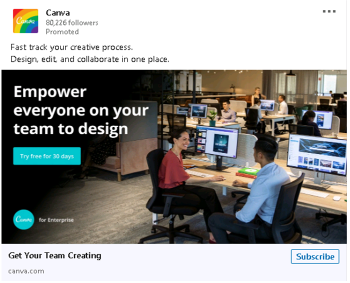
Canva is a free graphic designing website that allows individuals with no knowledge of design to create appealing graphics.
The above ad by Canva draws on the power of minimalism to attract viewers-apt for today’s attention-deficit audience. It conveys the message with minimal text and a simple-yet-effective image.
The ad clearly communicates the benefits of its offering-how you can expedite the design process using their tool.
Here’s another one from Canva:
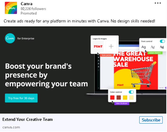
This creative cleverly targets e-commerce players who can craft impressive ads using Canva. It also stresses that you don’t need any ‘design skills’ to use the tool.
Salesforce is a popular cloud-based software company that offers a suite of enterprise applications focusing on customer relationship management, marketing automation, application development and analytics.
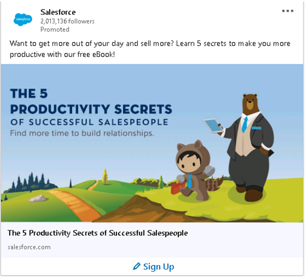
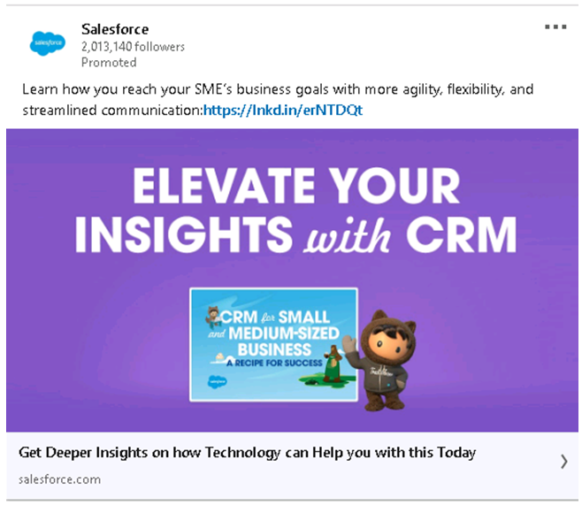
The above LinkedIn ad examples show how Salesforce leverages animation to craft stunning creatives.
In both these ads, the brand promotes their content to draw more visitors to their website without being overly promotional. Many big brands have successfully employed this method for projecting themselves as thought leaders.
3) LinkedIn
This is one name that should be on the list. After all, they are the ones who understand the best how this platform works.
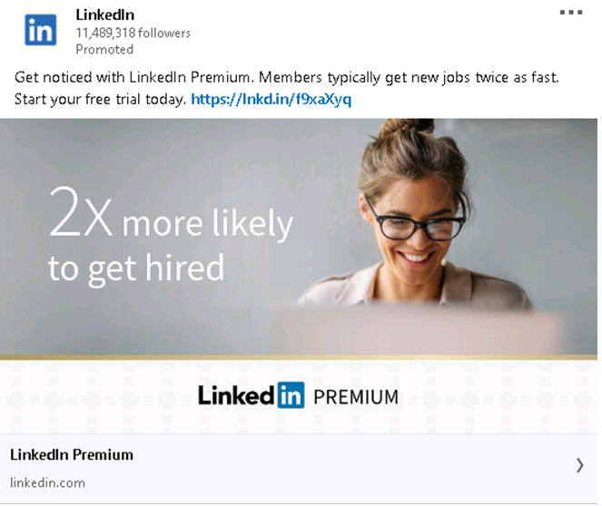
The above LinkedIn ad capitalizes on the power of numbers and statistics to draw user attention; ‘2X’ in the text overlay has been stressed upon. See how a minimalistic design has effectively conveyed the brand message.
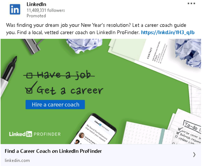
The above ad promotes LinkedIn ProFinder. It was well-timed-apparently created around new year when people start looking for a job change. It emphasizes how important it is to have a career and not merely a job-and that’s why job seekers find it particularly relatable.
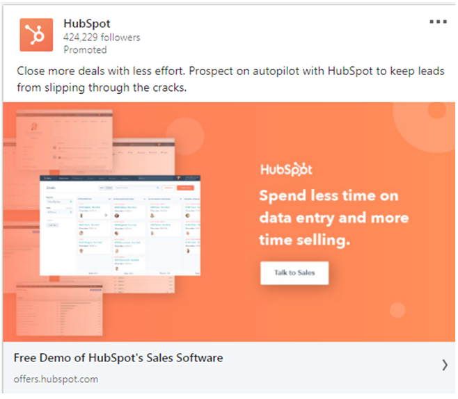
HubSpot offers software solutions for inbound marketing, sales and customer service. It’s also well-known for producing highly engaging creatives.
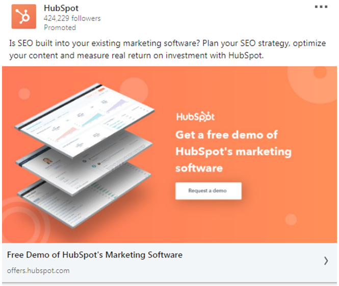
The above ad combines several features of an engaging creative: a straightforward call-to-action with a brief yet compelling copy. It also carries the look and feel of the brand.
Here’s another one:
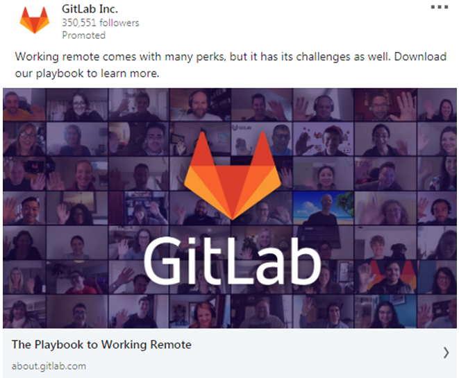
GitLab is a DevOps lifecycle platform that allows development, operations and security teams to collaborate on software development.
A lot of its ads draw attention merely because they are incredibly simple. They don’t say much yet deliver the message effectively.

The above no-frills ad, for instance, relies solely on numbers to convey the effectiveness of its platform. The promise of being 200% faster entices the viewer to click on the link and go to the landing page for more information.
Here’s another creative from the brand:
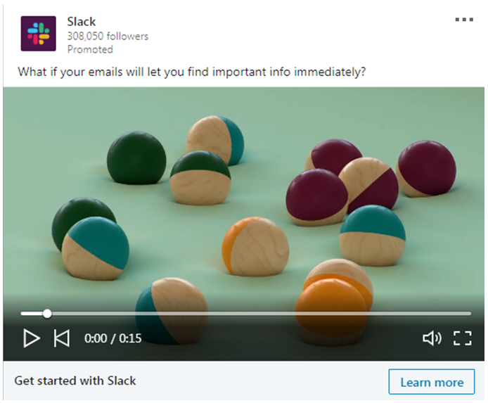
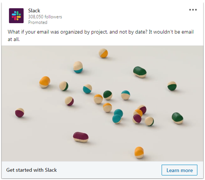
Slack is a cloud-based software tool that facilitates collaboration between team members and optimizes workflow with various integrations.
Slack creates a lot of snappy video ads wherein balls of different colors move in a haphazard way and eventually get organized into different channels. These themed ads demonstrate how you can harness their tool to optimize email management and get rid of email-related hassles.
Below we have shown two such LinkedIn ad examples:
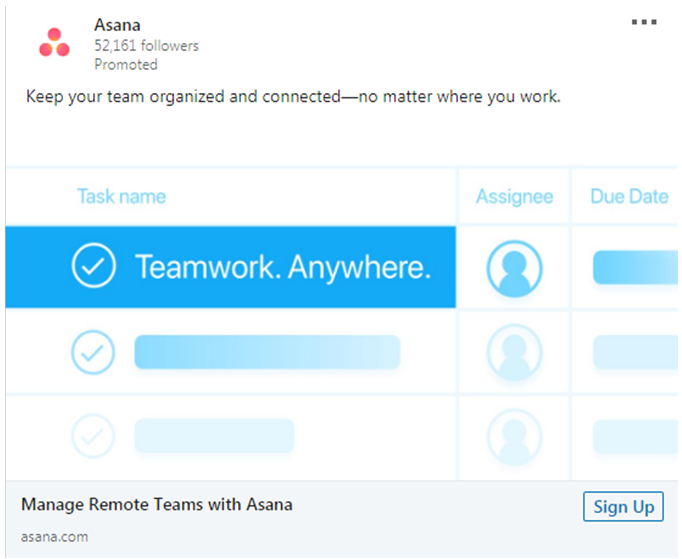
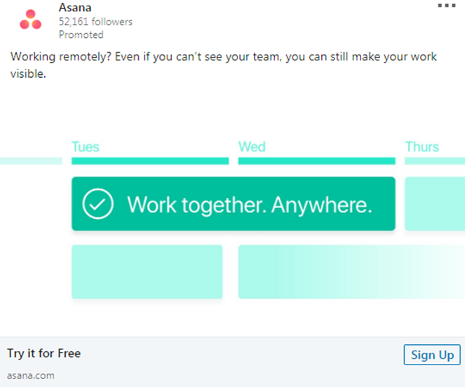
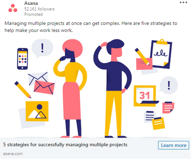
Asana is a work management platform that helps businesses organize their work. Like many other technology companies, Asana also uses compelling graphics to depict the benefits of their product.
Looking at the creatives above, you will realize how Asana is using animation to craft ads that are simple and yet capture viewer’s attention. What’s important to mention is that they have hardly used any text in these ads.
Microsoft isn’t just an industry leader. They are also adept at creating outstanding promotional content.
While none of their ads are run-of-the-mill, their carousel ads particularly stand out. Here are some outstanding carousel ads by Microsoft:
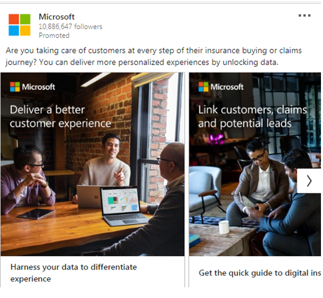
Evidently targeting insurance service providers, the above ad highlights the benefits of using data-driven solutions to deliver a personalized customer experience and asks the user to download their white paper.
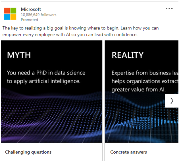
This Myth vs Reality ad highlights how AI Business School, an free online AI course by Microsoft can help businesses empower their employees with AI.
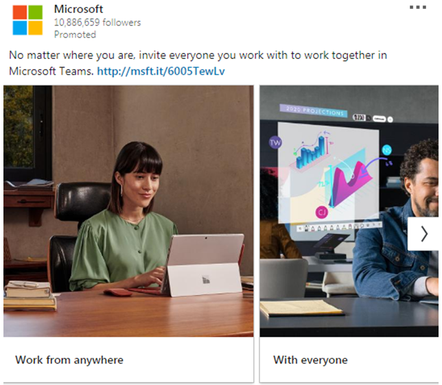
The above carousel ad by Microsoft portrays the benefits of its online collaboration tool Teams. It shows how you can use the tool to work from anywhere, with everyone and across devices.
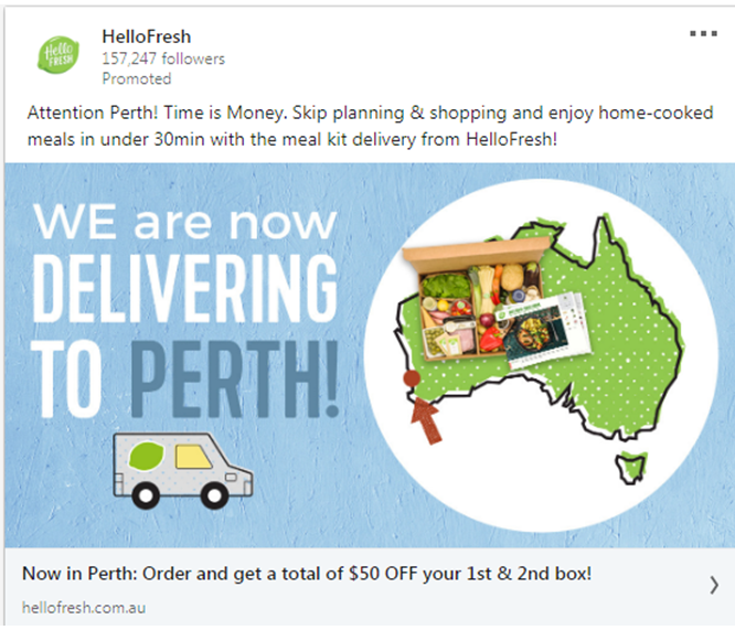
HelloFresh is a meal kit company based in Germany that operates in 11 countries.
This beautifully crafted ad from HelloFresh conveys the message that they have started delivering to a new location by showing it on the map.
While the map immediately grabs the attention of the viewer, there are other elements that compel him to act: ‘home-cooked meals in under 30min’, ‘50$ OFF your 1st and 2nd box’, etc.
Mailchimp is an American email marketing automation platform widely used by platforms across the globe.
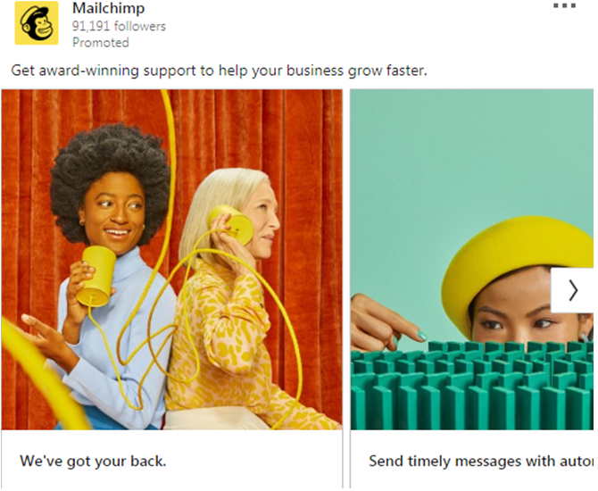
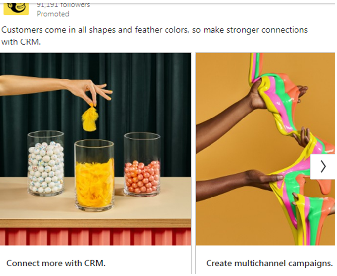
Among the elements that differentiate their creatives from other brands is their iconic bright yellow colour. The colour ensures their ads grab viewer attention. Besides, the quirky elements in their ads adds to their eccentricity.
A global culture management HR company, CultureIQ offers cloud-based solutions that facilitate employee engagement and culture management.
Many of their LinkedIn ads blend real images with animated graphics, all while maintaining the look and feel of their brand. Look at the creative below:
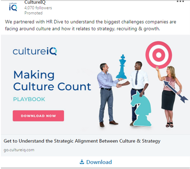
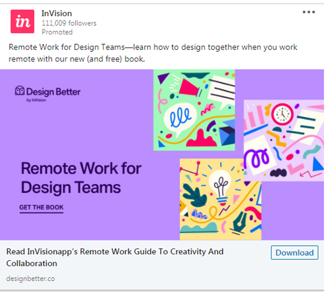
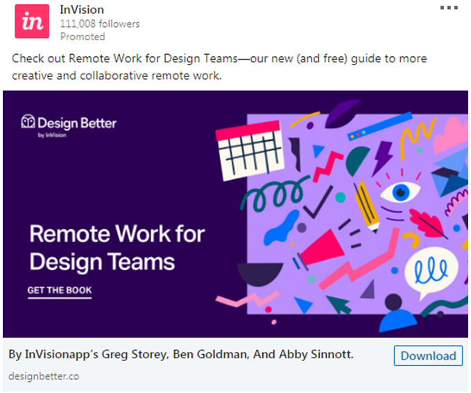
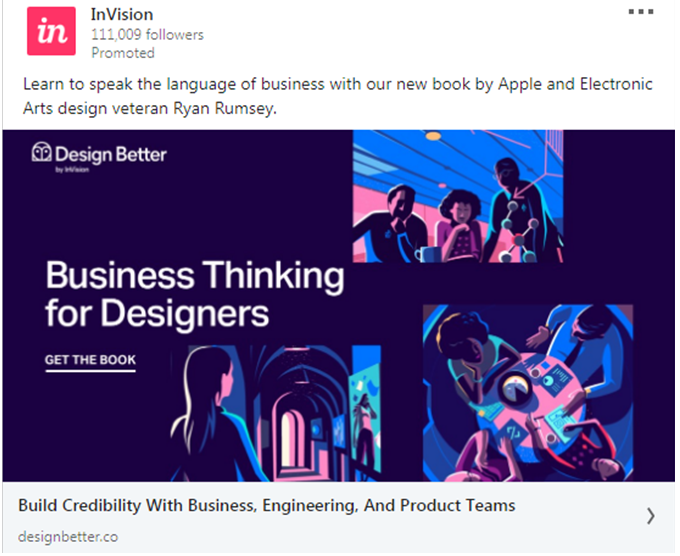
InVision is a New-York based company that offers prototyping solutions for designers. Because design is their forte, most of their creatives feature striking graphics that might tempt you to check out their website.
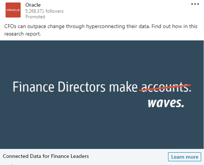
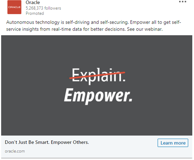
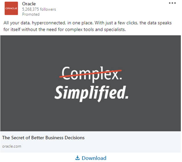
Oracle is an American technology company that sells enterprise-based software solutions.
While most of their creatives grab attention, what deserves mention are their special format of ads that create impact even with little text:
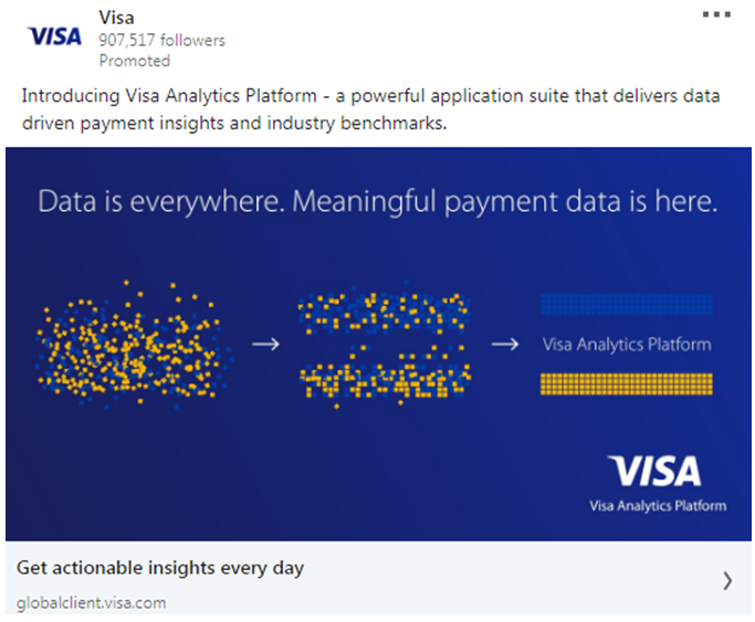
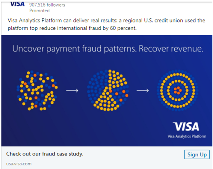
Visa is an American multinational corporation that facilitates electronic fund transfers through debit, credit and pre-paid cards.
Their creatives promoting their analytics platforms are particularly eye-catching. These combine a judicious display of patterns with an overall minimalistic design.
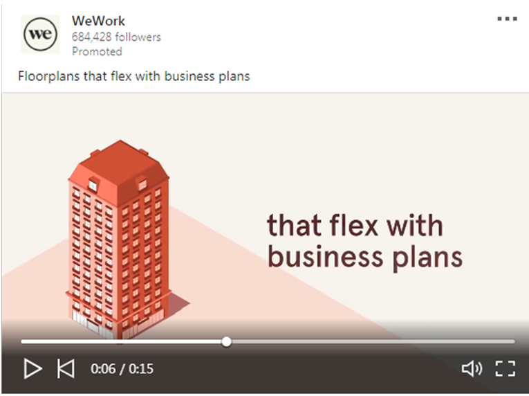
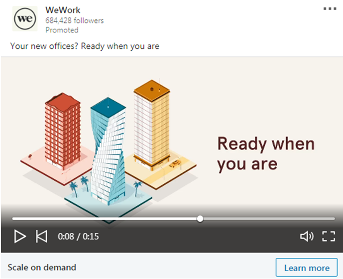
WeWork is an American real estate company that offers shared workspaces and other services for businesses.
Their snappy video ads emphasizing the flexibility of their solutions are worth a mention.
Wrapping Up
So, these are some LinkedIn ad examples you can borrow ideas from while creating your own. If you need help with creatives, get in touch with our social media marketing experts today. We will be glad to help you.