
 3935 Views
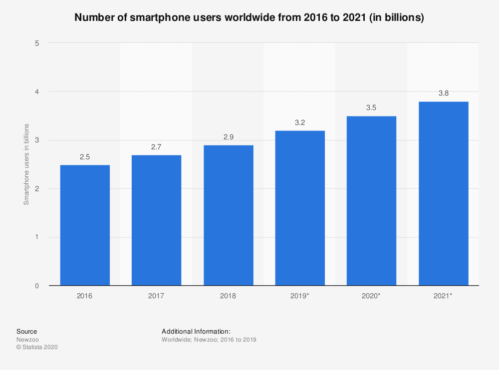
As technology has undergone rapid strides in the past couple of years, the number of mobile devices has skyrocketed.
As per recent statistics, globally over 2.9 billion people owned a smartphone in 2018 and the figures are expected to burgeon in the times to come.
So, if you own a website, there are high chances people who visit your website will be on a mobile device. If these people visit your website to see displaced text and pesky pop-ups, they will not perceive your brand in a good light. Most likely, they will leave your website to never visit again.
A mobile optimized website not only draws more traffic to your website but also augments your conversions. Even Google has announced that it will prioritise mobile friendly websites while deciding mobile rankings. Under such a scenario, it becomes imperative that you keep a mobile responsive website. And that’s what we are about to discuss in this blog.
So, let’s have a look at the ways in which you can create a mobile friendly website.
A quick solution for improving the responsiveness of your website is changing its theme. Agreed, this isn’t the best solution for an established site, but if you have just started and aren’t drawing too much traffic, installing a responsive theme can do wonders.
If your site is built on WordPress, changing your theme is a breeze. Just go to WordPress dashboard and click on ‘Themes’ under ‘Appearance’. Select ‘Install Themes’, then select ‘Responsive’ and hit search.
This will bring up all the responsive themes in the WordPress database for you to choose from. Select any of these themes and get it installed. Make sure your new theme looks fine on all screens.
In a bid to make mobile browsing a better experience for internet users, Google introduced the Accelerated Mobile Pages (AMP) project in 2015. AMP aims to improve page-loading speed for mobile websites to ensure they deliver a seamless experience.
AMP is an open-source web development framework that creates a stripped-down version of your webpages where all unnecessary media files and advanced layouts are removed. The AMP versions or mobile-friendly versions are served to users who access your website through a mobile device.
If you have a WordPress website, you can enable AMP using the right WordPress plugins. You can use these plugins to change the appearance of your webpages, letting you control how they look on mobile devices.
Google has time and again emphasized page speed as a critical ranking factor. Because AMP improves page speed, it reinforces your site’s ranking.
A desktop has a much larger screen than a mobile device. So, the desktop menu of your website can be extensive with plenty of options. But on a mobile device, you cannot afford to have a complicated menu. Everything should be concise enough to fit on a small screen. Otherwise, your visitors will have to zoom in and out to explore all the options.
Here is the mobile-optimized menu of Amazon:
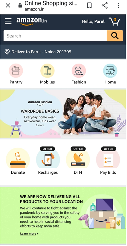
See how simple the menu is. It has few options, all of which are clearly visible above the fold.
Most of the desktop websites have a sidebar. On a mobile, this gets pushed to the bottom of the page and gets used rarely. So, consider removing this sidebar unless, of course, you find it absolutely necessary.
It’s convenient to navigate a website from a desktop or laptop. You can easily move the cursor using a mouse or keypad.
In contrast, navigating a website on a much smaller screen where your fingers do the work of a cursor can be complicated. For this reason, you should pay attention to the size and placement of different elements within your mobile website.
All the clickable elements should be large enough to be tapped with a finger. There should be ample space between buttons to ensure no one clicks the wrong one by accident. If your users have to tap a button multiple times to make it work, they might get frustrated and leave your website altogether.
Studies have shown more than half of mobile users use their thumbs to tap on their screens. Because it is difficult for a user to reach the corners of a screen with their thumb, you should keep the most important elements of your website towards the middle of the screen and avoid corners as much as possible.

While pop-ups mostly obstruct user experience, they are even more irksome on a mobile screen. Many times, these pop-ups fill the entire screen and are difficult to close.
As most users use their thumb to tap on a mobile screen, they find it cumbersome to reach the close button of a pop-up. While doing so, they might accidentally click on the ad and reach a new landing page. Such incidents can ruin their experience to a considerable degree.
So, it’s in your best interest to eliminate these pop-ups and devise new ways to promote whatever you are advertising through these pop-ups.
If you still feel the need to place these on your mobile website, test them a couple of times before placing them. Keep the following in mind:
Page loading speed is a critical factor in deciding the user experience of your website. A slow-loading webpage can turn off visitors and make you lose a considerable chunk of prospects. Hence, you must do whatever it takes to optimize website speed for mobile.
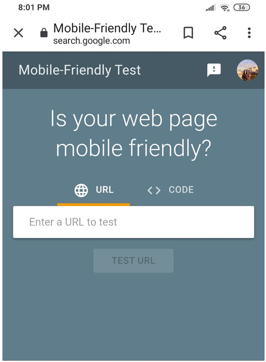
To begin with, test your mobile website’s loading speed to find how it is performing currently. You can, accordingly, implement changes.
Google’s Mobile Speed Test tool can come in handy here. The tool scans your site to identify how fast it loads on a mobile device. It also tells how your website performs compared to the competition and how much can you trim down your loading time.
Now that we have seen how you can test your loading speed, let’s discuss the steps you can take to optimize website speed for mobile.
Plugins such as WP Smush, EWWW Image Optimizer and ShortPixel Image Optimizer can come in handy here.
Mobile users often struggle to read text on a small screen. So, it’s critical that you use the font type and size that’s easily readable on a mobile device.
In addition to this, use a lot of empty space on the screen of your mobile website. Minimize the amount of text on your screen. Keep your sentences and paragraphs as short as possible. Don’t keep more than 35-40 characters per line.
Large blocks of text on a small screen can hurt a user’s eyes and take more time to read; he may have to zoom in to understand what’s printed. So, such elements are best avoided on mobile websites.
Media queries are critical to a mobile responsive website.
You might have come across webpages that not only resize when the screen size changes but also reshape. Several elements become wider or narrower than before and some even change their location. Such pages use media queries to improve their responsiveness.
If you are still wondering what a media query is, they are filters you can apply to CSS styles. These queries make it easy to change styles depending on the characteristics of the device displaying the content: width, height, orientation and resolution.
Here is a simple media query:
@media screen and (max-width: 1020px) {
#container, #header, #content, #footer {
float: none;
width: auto;
}
p{ font-size: 2em; }
}
The above query states that when the screen size is more than 1020 pixels, all the code within the query should apply.
If you want to apply a media query to certain parts of your webpage, simply load your webpage and drag a corner to make the screen smaller. If you find certain elements of your screen going out of proportion, create a media query to optimise them. You can create any number of queries on a single webpage.
All your efforts in optimizing your website can go down the drain if your web host isn’t reliable.
Unless you have a brand-new website, you should keep away from inexpensive shared hosting plans where multiple clients are hosted on a single large server. If you opt for such hosting plans, your website can experience glitches if your neighbouring sites face a traffic spike.
For a seamless user experience, choose a dedicated hosting plan if your budget allows. In dedicated hosting, a single large server is dedicated to hosting your website. As a result, you enjoy a great deal of control over your website’s speed and performance.
What’s important to remember is that your web host should support caching content. Caching can considerably reduce the loading speed of your website for both desktop and mobile users and enhance their browsing experience.
So, which of these mobile website optimization tips are you planning to implement on your mobile website? Please scribble in the comment section below. Thanks for reading.


