-
Get Cloud GPU Server - Register Now!
Toggle navigation
With more and more brands taking to the digital podium, the number of websites have skyrocketed in recent years. In fact, according to a recent study by Netcraft, there are over 1.1 billion websites on the internet today. Such a scenario has led to cut-throat competition, requiring brands to draw their audience’s attention and make them stay on their site.
One of the most effective ways of doing this is by creating a visually-appealing and intuitive web application. Whether you are a seasoned professional or have just ventured into design, you need to be aware of the trends that are expected to dominate the design space in the days to come.
In this post, we are presenting a rundown of the UI/UX design trends for 2021 and beyond.
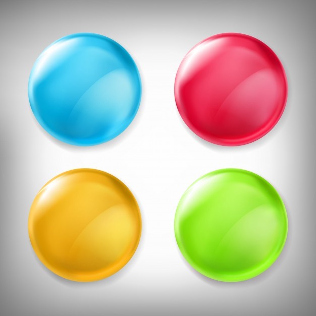

3D elements have caught the attention of users for over several years now. As technologies like AR and VR gain traction, this trend will only grow stronger.
UI/UX designers are creating immersive hyper-realistic 3D elements to enhance the aesthetics of their websites. Such visuals lure users as they transcend the boundaries between virtual and real life. As a result, visitors stay longer on your website. And their chances of getting converted to prospects (and eventually customers) increase manifold.
One of the prerequisites for implementing a successful 3D graphics implementation is a high-performing website UI. If your web application isn’t well-optimized for speed and performance, it won’t support such elaborate elements. And your users may experience slow response time, high page loading time, etc.
To entice users, brands need a weave an engaging story in addition to offering a seamless user experience. Storytelling bestows an array of benefits upon your brand. It helps build a positive emotion around your offering.
Well-concocted stories make users feel as if they’re a part of your brand. As a result, they want to associate with you. So, all in all, storytelling is a potent tool that can improve the performance of your brand in the long run.
These days, website designing companies are incorporating storytelling principles into their designs, particularly in digital product designs. They are devising innovative ways of transferring information to users. Typography, bold colors, animations, illustrations and interactive elements are being combined to create a solid and balanced visual hierarchy.
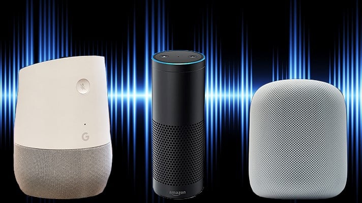
Voice assistants are on the rise. Around 72% of the people using voice speakers say they are a part of their daily routine. Amazon Alexa and Google Home are increasingly being used for carrying out basic functions such as playing music and checking the weather. In other words, the trend for voice commands is on a steady rise.
People interact with their apps at times when they are busy with chores like cooking or driving. Given the fast-paced routine of these users, it’s highly likely that the trend for voice UI will surge in the days to come. As a result, UI designers will have to master the nuances of voice design. And brands will seek voice UI designers.
With voice gaining prominence, an array of challenges related to privacy, security and ethics will emerge and companies will have to come up with ways to deal with them.
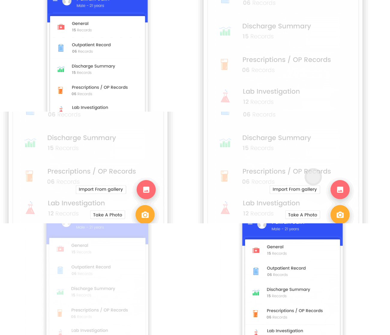
Micro-interactions are the minute interactions consumers experience as they use a web application: mobile app or website. Every time you open an app or a website, you experience these moments. For instance, article progress bars, scroll bars, swipe animation and email notification are all instances of micro-interactions. Some of these grab user attention or offer tips; others offer feedback on completed actions.
At times, we are not even aware of these micro-interactions as they blend seamlessly into the user interface. If, however, your product lacks engaging micro-interactions, your users may have a sub-par experience.
Current UI/UX design trends lean towards the incorporation of these micro-interactions in the mobile app or website so that the overall user experience reaches an altogether new level. Small, subtle changes are being introduced every single day. As the number of digital devices rises, opportunities for creating brand new micro-interactions will emerge in the next couple of years.
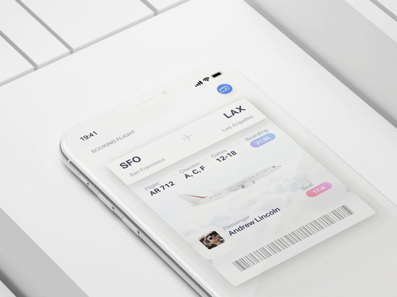
Image Courtesy: uxplanet.org
A website with static images and content may be considered acceptable today but will be perceived as boring a few years down the line. Motion design brings life into your graphics through animation and clever visual effects.
Imagine a webpage where the data changes from frame to frame. But motion design isn’t merely about creating an aesthetically-pleasing experience. It is also about creating a smooth user experience. Animations and transitions engage the user, facilitate navigation and usability and convey your brand in a positive light.
In 2021 and beyond, as high-speed internet technology and 5G continue to flourish, motion design will undergo a revolution. We’ll witness UI-UX designers striving to strike a balance between static simplicity and immersive interactivity. More and more brands will tell their story through meticulously-crafted motion designs.
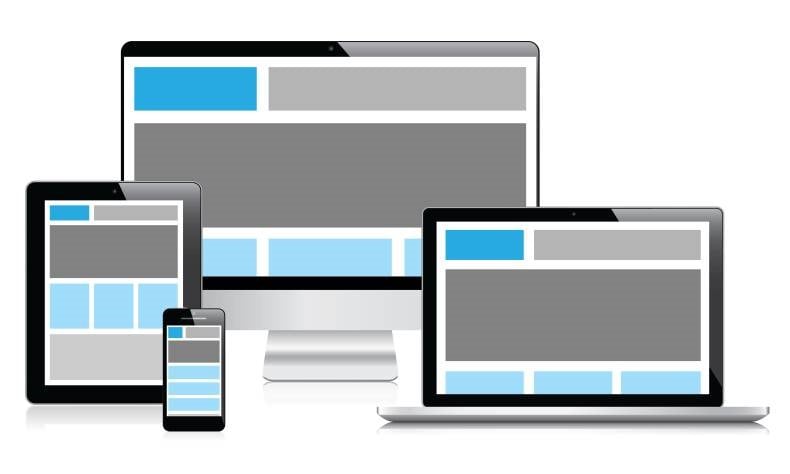
In an era where consumers tend to own and use a range of digital devices, creating a device-agnostic experience becomes vital. They shift from a laptop to a smartphone and back to a laptop; such a user behavior demands brands to be flexible.
A device-agnostic experience doesn’t concentrate on a single device; it considers the user journey as a whole. It builds a user journey that can pass through different touchpoints-smartphones, laptop, desktop-seamlessly. Device agnostic UX allows the user to pick where they had left their last interaction and complete it at their convenience.
Let’s elaborate this with a simple example. While scrolling through the Facebook feed on your mobile, you come across an ad showcasing an interesting product. You click on the product and are directed to the product website. You add the product to your shopping kart but for some reason refrain from making the purchase. A couple of days later, when you finally decide to purchase, you log in on the website through your desktop. Now, for this entire experience to be hassle-free, the product brand should have created a device-agnostic experience.
As high-speed internet and 5G become ubiquitous, brands will need to tweak their approach to UX design. They will have to offer an experience that focusses more on the holistic journey of the user and less on individual devices.
Because design is a broad field, it is experiencing a shift towards specialized job titles. One of the most recent titles that have come in demand of late is that of a UX writer.
We all know that copy is an integral part of the overall user experience. With a writer dedicated to the design team, you can follow a consistent content strategy while designing your digital product.
It’s essential to note that UX writers aren’t the same as copywriters. They are responsible for composing all the text that appears on the user interface of a website/app: call-to-action, error messages, menu titles and form fields. They work in close coordination with the design team and try to establish a voice for their brand.
Several technology behemoths including Google and Amazon have UX writers in their design teams and with the increasing emphasis on delivering an exceptional user experience, we are likely to witness a spike in demand for UX writers.
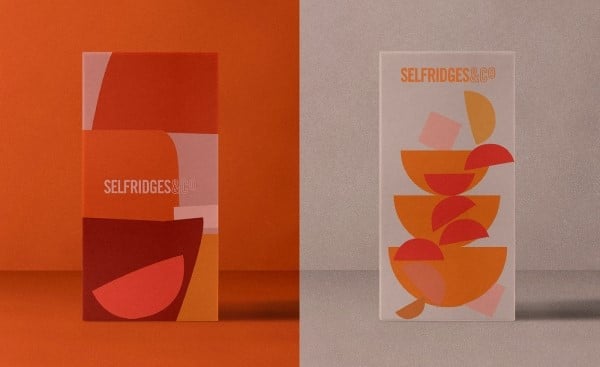
Image Courtesy: Caterina Bianchini Studio
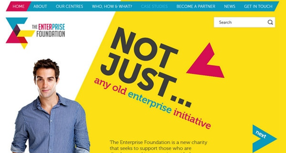
Image Courtesy: designmodo.com
Conventionally-used template-based layouts are going out of vogue. UI designers are coming up with asymmetrical layouts consisting of elements placed in an unusual fashion. These layouts have a lot of overlaps and ample whitespace. The elements are placed in such a manner that they can attract the attention of the user in the direction they want.
Used the right way, asymmetrical layouts can add lots of appeal, character and personality to designs. They offer a lot of room for creativity as the opportunities while creating an asymmetrical layout are countless.
That said, such layouts need practice and time; merely placing elements randomly on the grid will not serve the purpose. Besides, you need to keep in mind user needs while implementing the design.
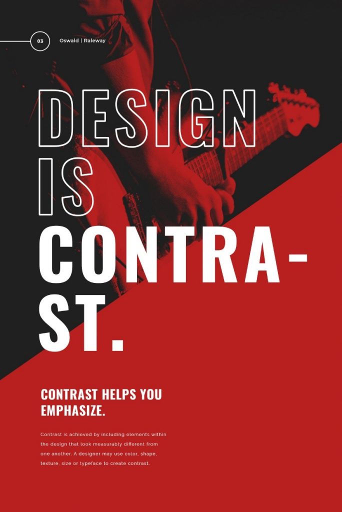
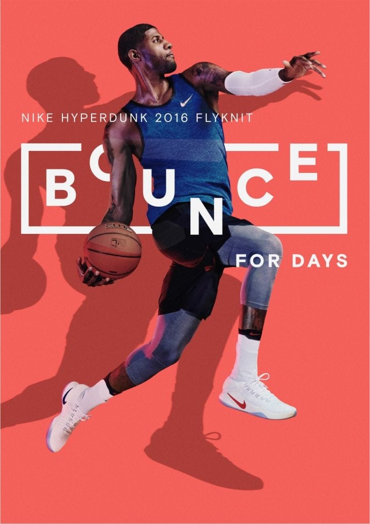
Bold typography has been in vogue for the past couple of years; it will only grow bigger in 2021 and beyond. Bold typography not only looks appealing but also entices the visitors on a website. As a result, they end up spending more time on it. It also imparts a modern look and feel to the site.
Having said that, bold text that doesn’t say much may not yield the desired results. You can grab user attention using large text, but they may not convert if they aren’t offered a solution to their needs or a compelling call-to-action that invites them to take the next step towards conversion. So, it’s vital that you provide users with a strong reason to stay on your page and explore it.
Below are some instances of bold typography:
Of late, it has been observed that several organizations have stopped using a single color to represent their brand. Instead, they have adopted a responsive color scheme where the brand changes color depending on the context. These brands either have an array of predefined colors or adopt a dynamic color scheme that takes the color of its environment.
Dropbox and Spotify adopted this practice long ago; Instagram’s colorful logo is also quite responsive across multiple platforms and blends beautifully with different backgrounds. In the times to come, we expect smaller brands to follow suit and experiment with colors.
So, which of these elements are you planning to incorporate in your design strategy? Let us know in the comment section below. Thanks for reading.